 You often see heat maps displayed in most places these days. Basically, you can find them anywhere there’s data to display — weather reports, real estate sites, and in this case, a company’s landing page or website.
Have you ever wondered why? Apart from displaying large volumes of data for more comprehensibility, heat maps provide a great way to see through data to trends and understand what to do next. And nowadays, heat maps are great for representing complex statistical data.
As most people know, heat maps use color mainly as a data visualization tool. The tool uses warm-to-cool color spectrums to show you which parts of your landing page are receiving the most attention. The heat mapping software works by collecting data from a page and displays said data over the same web page itself. So, heat maps basically make visualizing analytics data easy, and tracking web activity even more effective.
Read More: Hitting The Spot with Location Data
Heat Map Analytics Tools
Like most analytics software — as a whole — heat map analytics also offers different kinds of tracking tools. These kinds of tracking tools include a hover map, click map, and a scroll map. All three allow you to track visitor behavior in different aspects.
Hover Map
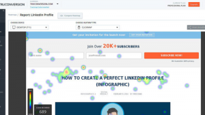
Hover maps are often referred to as mouse mapping — and for good reason. Hover maps show the mouse movement of the visitor. Some areas of a site’s landing page have more movements, and some have less. To represent high movement in a single area, that part is highlighted in red color.
Scroll Map
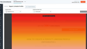
Scroll maps are useful for deciding page length. Whether you want to include massive chunks of information or you want to decide where to place important information, a scroll map can tell you the optimal place to put it.
Click Map
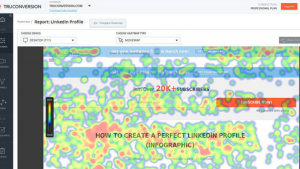
As evident with its name, click maps mainly tell you which area of the page gets the most clicks. It also tells you which buttons get the most attention. This is beneficial in a way that it helps you figure out your CTA buttons — if it works for you or not.

Read More: Location Data and Machine Learning Form the Hilt of New-Age Cross-Screen Advertising Attribution
Using Heat Map Data
With heat map analytics’ basic functions in mind, along with the tracking tools widely used, we can now get a vague idea about what kinds of action are appropriate for the results that heat maps display.
Understanding how your visitors interact with your site will help you formulate corresponding strategies to make them stay and eventually convert them into loyal customers. Furthermore, determining these things will guide you in identifying what aspects of your website need improvement.
So when and where should you use the data that you gather from heat map analysis? Frankly speaking, experts would tell you to make use of heat maps all the time — especially in situations where your site is undergoing extensive remodeling.
Content Marketing
Whether its word content or visual content, it’s placed in your site’s pages to hopefully draw your visitors in, and keep them engaged.
But imagine your surprise when you find out your content isn’t gaining enough attention as it should. Are your users reading it? Are they clicking on it to even begin with? A heat map tool like the scroll map can help you determine if your audience is scrolling all the way to the end of the page. That way you can see if your CTAs are getting the attention they should.
Sometimes an 8,000-word highly in-depth article isn’t enough to hold all of your visitors’ attention — no matter how educational and informative it is. But there are also times when your visitors don’t necessarily reach the end, but a lot of the red is concentrated highly around your CTA button.
On the contrary, doesn’t the second scenario mean better news? Not only are you reaching the right audience, you’re eliminating the unqualified ones. With that kind of visual data interpretation, you have plenty of room to plan your next content. How long it should be; whether content should be purely text, purely visual, or both; or where you should place your relevant internal links, etc.
Website Redesign
Redesigning a website happens for innumerable reasons, but nevertheless, making it happen takes time and finances. And the last thing you want is to end up with a site that’s working worst than the original.
In response to that, graphic designers and web developers can make use of heat map analytics’ data to understand what attracts a customers’ attention, which graphic elements are effective, and where to place buttons.
Of course, it is well known that both developers and graphic designers are familiar with where these elements should be in principle. But then again, what we often visualize in our heads doesn’t always translate to reality.
Different audiences behave differently on various websites. By making use of hover maps and click maps, the people in charge of redesigning can see which areas of the page receive the most interaction (you’d be surprised at how many clicks visuals on your site can attract).
In knowing how audiences and visitors behave on your site’s page can save you from making massive mistakes, and winding up with a site that does little for lead generation and conversion. Heat map data can also help you create a website that’s easier to navigate.
A/B testing
The importance of conducting A/B testing after redesigning or after auditing is undeniable. To ensure which gets more attention, and how they can cater to people’s needs better, A/B testing is crucial if a business is to thrive successfully.
That also means getting the right results of the testing is as important. So, how do you know if you’re doing things right?
Heat maps instantly paint a visual representation of what your customers are doing behind their computer screens. If there’s one thing that heat maps are surely capable of providing, its usable insights.
The Key Takeaways
How you interpret heat maps analytics’ data is entirely up to you. According to the results produced by a heat map analysis, you can make adjustments that will suit your visitors’ preferences.
What makes heat maps so successful is that they are purely self-explanatory. Charts and tables and pie graphs have to be interpreted. Heat maps, on the other hand, show data plainly, and you can make use of the given analysis to tweak your design strategies.
Other things to learn from heat maps:
- What distracts visitors from gravitating towards your core content (like they should be)?
- Which visuals attract your audience’s attention?
- What users do with the visuals you provide on your site?
- Whether visitors fill out your contact forms
- If your site is navigable
- Whether your content is noticed and read, and how much of it is read
If done properly, utilizing heat mapping analysis paired with conversion rate optimization can quickly boost your online sales without too much increase in marketing costs and financial investments.
Read More: Blis Defines “Romantic Buyers” Based on Location Data and Contextual Targeting


