Warner Bros. swapped its iconic gold-and-blue shield logo with a more modern blue-and-white shield — and consumers aren’t happy with the change
Warner Bros. may have a win with “Joker” — the most-nominated film for the 2020 Academy Awards — but its new logo is not a winner, according to a new survey from Visual Objects, a portfolio website.
About 89% of consumers prefer the old Warner Bros. logo to the new one.


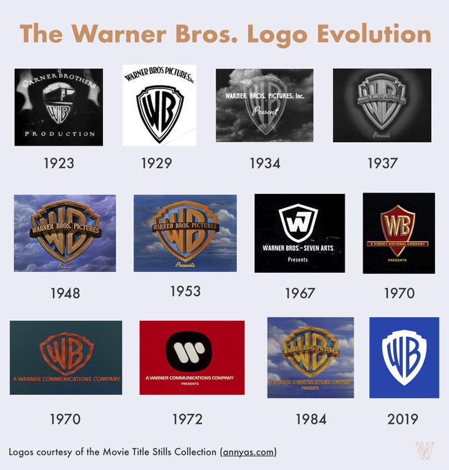
Warner Bros. launched its redesigned logo in November, replacing its iconic 3D gold-and-blue shield design with a flat blue-and-white shield design. It was the company’s first major logo rebranding since 1984.
The Warner Bros. shield design first appeared in 1920s. Consumers have come to know the entertainment company by its iconic logo.
Marketing Technology News: ZypMedia Expands Product and Engineering Leadership Team
“By trading the dominant gold color for just a bland blue-and-white logo, Warner Bros. forfeits its heritage and the legacy of its past,” said Mitch Goldstone, film historian and CEO of ScanMyPhotos.
People feel nostalgia for the former Warner Bros. logo.
New Warner Bros. Logo Is in Line With Current Logo Design Trends
People may not like the redesigned Warner Bros. logo because it is too similar to other logos.
The new “flat” Warner Bros. logo is on-trend with other recent logo redesigns such as Lord & Taylor and Sears.
“Flat, one-dimensional designs seem to be considered more modern than their three-dimensional counterparts,” said Melanie Davis, a writer at Hotels4Teams.
People think the flat logo isn’t as visually appealing as the former 3D one, though.
“[The new Warner Bros. logo] is boring and blends in with the sea of other flat logos now,” Davis said. “The gold-and-blue shield caught your eye.”
In addition, the blue-and-white color of the new logo is too similar to another brand giant — Facebook.
“[Warner Bros. has] gone with the overused ‘white-and-blue’ color palette, which reminds me of Facebook,” said Luka Arezina, editor-in-chief at data security blog DataProt. “If you’re watching a Warner Bros. movie with your kids, the last thing you want to be reminded of is social media.”
Marketing Technology News: Plannuh Raises $4 Million To Expand AI-Driven Marketing, Budgeting and Planning Platform
Consumers Feel Nostalgia for the Old Warner Bros. Logo
From “Wizard of Oz” and “Casablanca” to “Looney Tunes” and “Harry Potter,” people know Warner Bros. for its movies that begin with its iconic 3D shield.
“On a personal level, I don’t really like the change because I have really fond memories of watching Warner Bros. cartoons all my childhood,” said William Taylor, career development manager at VelvetJobs.
Visual Objects surveyed 1,001 consumers across the U.S. to find out their opinions on the 2019 Warner Bros. logo redesign.
Marketing Technology News: Wealth Access Enhances User Productivity with DocuSign Integration


